
If you're over 50 and trying to learn online business skills, it's easy to feel like everyone else got the memo years ago. You may already be wondering whether something as simple as sending an email now requires a level of tech knowledge you don't have. I understand that feeling. When money feels uncertain and Retirement doesn't look as secure as you hoped, even small digital tasks can seem heavier than they are.
But you're not behind.
Mobile friendly emails aren't about becoming a coder. They're about making your message easy to read on the device your reader is already holding in her hand. That's all. It's less about technology and more about courtesy, clarity, and trust.
You Can Create Emails Your Readers Love to Open
I remember the first time I worried about this. I had written an email carefully, read it twice, fixed the typos, and felt proud of it. Then I had one thought that took all the wind out of me. What if it looks terrible on a phone?
That fear is common, especially when you're building something new and want to be taken seriously. You don't want your email to feel sloppy. You don't want a reader to open it, squint at it, and close it before she even gets to your message.
The good news is that mobile friendly emails are not a secret skill reserved for tech people. They follow a handful of simple ideas. If you can make a letter easy to read, you can learn to make an email easy to read on a phone too.
Mobile friendly design is often just digital kindness. Bigger text. Cleaner spacing. Fewer obstacles between your reader and your message.
Think about the difference between a cluttered kitchen counter and a clear one. On the clear counter, you know where everything is. You can move easily. You don't feel stressed. That's what a good email does for the reader.
If you're also trying to improve what you say in your emails, this guide on how to write emails that sell in a simple reassuring way pairs nicely with the design side of things.
What readers really want
Recipients don't open an email hoping to admire fancy formatting. They want to know three things quickly:
- Who it's from: They want to feel safe opening it.
- What it says: They don't want to work hard to find the point.
- What to do next: If there's a link or button, they want it to be obvious.
When you remember that, this gets simpler fast. You're not trying to impress people. You're trying to help them.
Why a Mobile First Mindset Matters Now More Than Ever
A mobile first mindset means you begin with the small screen in mind. You don't write for a giant desktop monitor and hope it somehow shrinks nicely. You ask, "If someone opens this while waiting in line or sitting on the couch, will it still feel easy?"
That question matters because by the mid-2020s, 60% of all email opens came from mobile devices, according to this 2025 email marketing statistics roundup. More than half of your audience is likely reading on a phone.
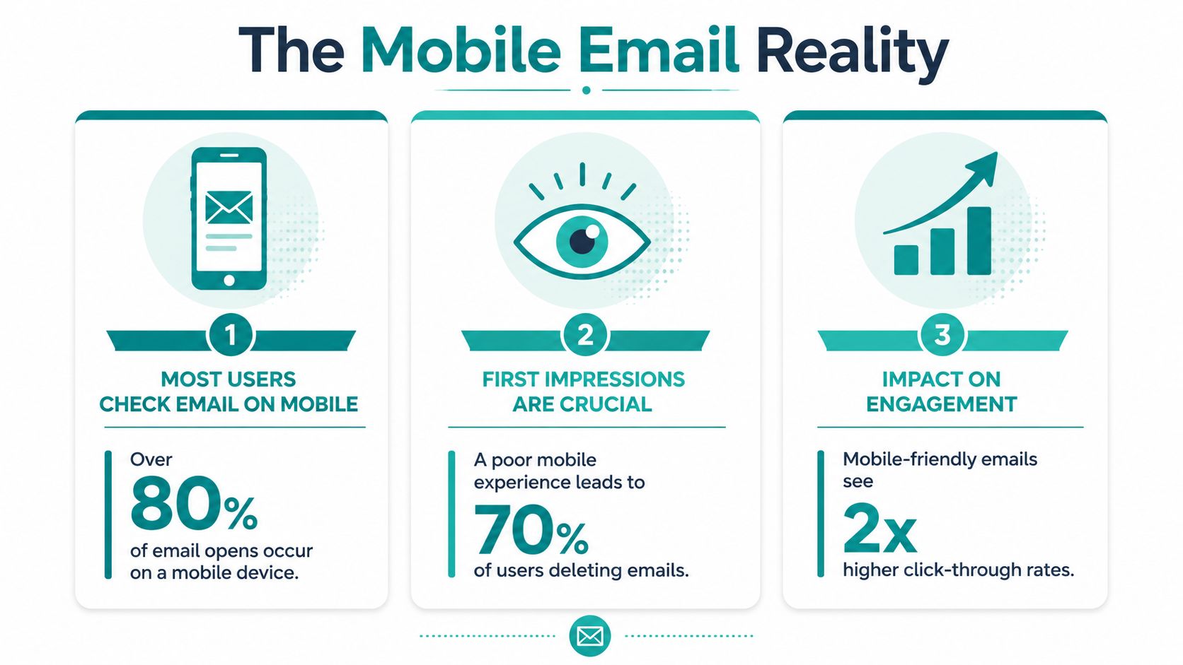
That's not bad news. It's a helpful reality check. Your reader is still showing up. Email still matters. In fact, that same roundup projected 4.6 billion people would use email worldwide in 2025, which tells us the channel is still woven into daily life.
What a poor phone experience feels like
You already know this feeling from your own inbox.
You open an email and the text is tiny. The layout is too wide. You have to pinch and zoom, then scroll sideways, then hunt for the button. By that point, your patience is gone.
Another source reported that 42% of recipients delete emails that are not optimized for mobile, and that 81% of users open emails on their smartphones, as noted in these mobile email statistics from Stripo. That doesn't mean you should panic. It means your readers are telling you something very practical. They want ease.
When a reader struggles to read your email, she doesn't just leave the message. She loses a little trust in the sender too.
That's why mobile friendly emails matter beyond design. Your list is an asset. It's part of the peace of mind you're trying to build online. If you care for that list well, people notice.
If you're still deciding which tool to use, this comparison of email platforms for small business beginners can help you choose a system that makes mobile previews and testing easier.
The Three Simple Pillars of Mobile Friendly Email Design
A mobile friendly email is a courtesy. It says, "I know you're reading this in the middle of real life, maybe one-handed, maybe between errands, and I will make this easy for you."
That mindset lowers a lot of the fear around design. You are not trying to build something fancy. You are arranging your message so another person can absorb it without strain.

Single column keeps attention in one place
A single-column layout works like a clear path through a room. Your reader knows where to look next, and nothing competes for attention on a small screen.
One practical approach is to build your email in a narrow, simple format, often around 600px content width, as explained in this mobile optimized email design guide. You do not need to hold onto the measurement. The useful takeaway is easier than that. If the layout feels tidy and linear, it will usually feel better on a phone.
A simple structure often looks like this:
- Opening: One clear headline or first sentence
- Body: Short sections with room between them
- Action: One main button or link
- Footer: Extra details only if they help
This pillar also helps your message itself. If your email needs three columns, five graphics, and several competing offers, the design problem may really be a clarity problem. A smaller, cleaner email usually asks for a smaller, cleaner message too.
If engagement has been slipping, it can also help to review the quality of the audience receiving your emails. A cleaner list often makes design choices easier to judge because you are writing for people who want to hear from you. This guide on how to clean an email list walks through that process in plain language.
Readable text reduces effort
Good mobile text feels relaxed. Your reader should not need to zoom, squint, or reread a sentence just to catch your point.
Body text at 14px or larger and buttons sized for a thumb tap are common recommendations. The reason is simple. Phones are small, hands are imperfect, and attention is usually split. Design that respects those limits feels considerate.
Here is a helpful way to check readability:
| Part of the email | What helps on mobile |
|---|---|
| Subject line | Clear wording with no extra clutter |
| Body copy | Short paragraphs and simple sentences |
| Headers | Easy to scan in a quick glance |
| White space | Visible separation between ideas |
Plain often works better than polished-looking clutter.
Many beginners worry that a simpler email will look less professional. In practice, readers usually experience it the other way around. If they can read your message quickly and understand what matters, the email feels thoughtful and well made.
Buttons should remove hesitation
A button has one job. It should help your reader act without stopping to figure things out.
That means the button needs enough size, enough space around it, and wording that makes sense on its own. If several links are crowded together, a phone user has to slow down and aim carefully. That tiny moment of friction is easy to overlook on a desktop and easy to feel on a phone.
Useful guidance often suggests leaving space around clickable elements so the wrong link is not tapped by accident. One clear action is usually kinder than several equal choices.
If you write for business audiences too, these B2B email design strategies show how clear structure and readable calls to action can still feel polished.
The principle behind all three pillars is simple. Help the reader feel guided, not tested. Once you see mobile friendly design as a small act of care, the rules stop feeling technical and start feeling natural.
Your Calm Checklist for Sending with Confidence
Most of the anxiety around email comes right before you hit send. That's when doubts show up. Did I miss something? Will this look strange? Did I make it too long? Too crowded? Too plain?
A checklist helps because it turns vague worry into a clear habit.
A simple pre send review
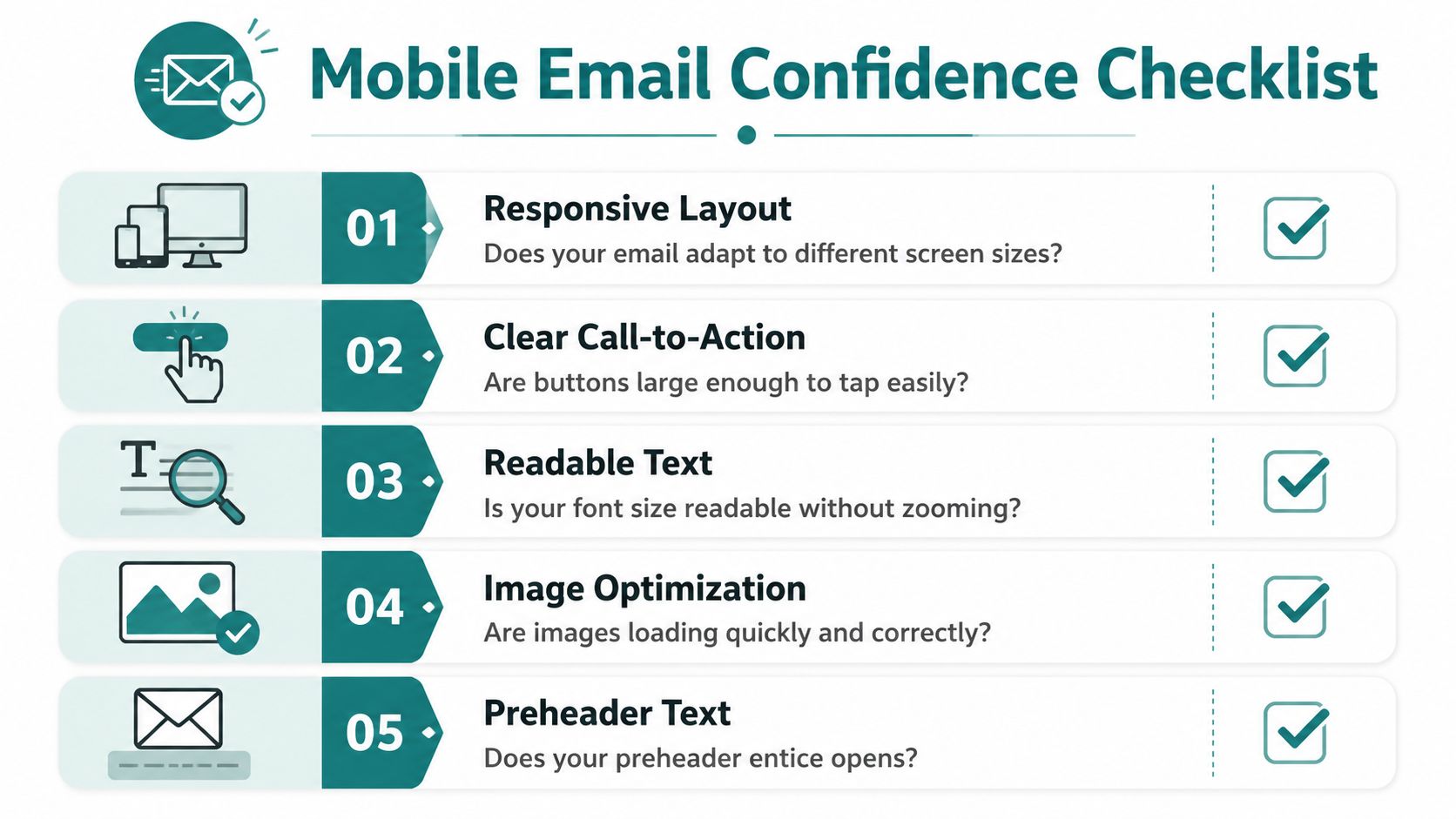
Before you send, pause and ask yourself these questions:
- Is the layout easy to follow: One column is usually the safest choice for a phone.
- Can I read it without zooming: If the text feels small on your own screen, your reader will feel it too.
- Is there one main action: One button or one clear next step is easier than several competing choices.
- Are the images lightweight and useful: Mobile guidance often recommends compressing images to under 200 KB and avoiding heavy animated files, as noted in this mobile-first email testing and coding guide.
- Does the email still make sense if images don't load: Your words should carry the message, not just your graphics.
That last one matters more than many people realize. Plenty of readers skim quickly or have image loading issues. A strong email still works when the visuals are delayed or absent.
The step that builds real confidence
Send a test email to your own phone.
Not your laptop. Not just the preview inside your email platform. Your actual phone.
Open it the way a subscriber would. Scroll naturally. Try tapping the button with your thumb. Notice whether the subject line makes sense in the inbox. Read the first few lines without zooming.
Test on the device your reader is most likely using. You'll spot problems faster than any amount of overthinking.
If you want to keep your list healthy as you improve your email experience, this guide on how to clean an email list is a helpful next step. A clean list and readable emails work well together.
If you still feel unsure
Use this shorter version and keep it near your desk:
- Clear subject line
- Short opening
- Easy-to-read text
- One obvious button
- Test on my phone
That's enough to send many good emails with confidence.
Going a Little Deeper Answering Your Questions
Once the basics are working, a few thoughtful details can make your emails kinder and more dependable for more people. Mobile-friendly emails then evolve beyond layout, becoming communication that includes people instead of leaving them out.
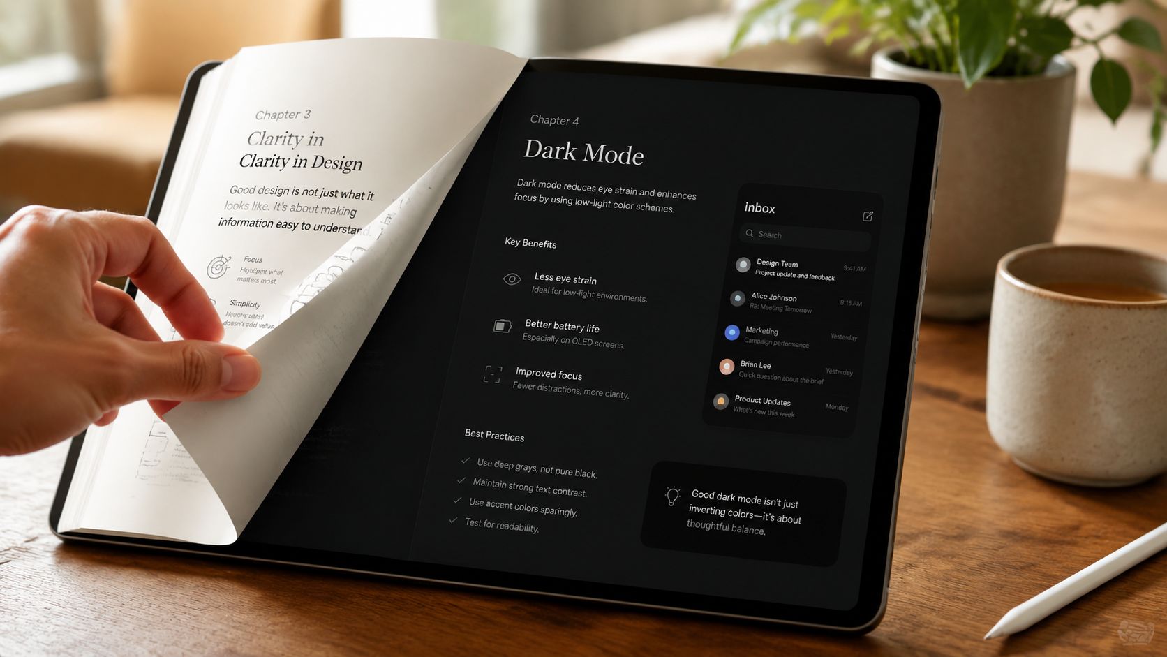
What about dark mode and preheader text
Dark mode is a display setting many people use on phones and tablets. If your text and button colors don't have enough contrast, an email that looked fine in one setting can become hard to read in another.
Preheader text is the small line that often appears after the subject line in the inbox. Think of it as a second chance to make your message clear. It doesn't need to be clever. It needs to be useful.
A good preheader supports the subject line by answering a quiet question in the reader's mind. What's inside, and why should I open it?
Accessibility is part of good manners
True mobile friendliness goes beyond layout. It also means designing for screen readers, considering image-blocking, and ensuring good contrast in dark mode. Adding descriptive alt text to images is a simple step that ensures your message is accessible even when visuals don't load or can't be seen, according to these mobile-friendly email accessibility guidelines.
I used to forget alt text all the time. Then I heard from a reader who depended on clear descriptions when images didn't display properly. That small detail stopped feeling optional after that. It felt personal.
Here are a few ways to keep your email more inclusive:
- Add alt text: Describe what the image is or what action it supports.
- Use descriptive links: "Read the guide" is clearer than "Click here."
- Keep contrast strong: Make sure text stands out from the background.
- Use live text when possible: Don't place your whole message inside an image.
If you're exploring broader ways to improve performance while keeping your messages reader-friendly, these boost campaign email strategies may give you a few extra ideas.
Keep trust at the center
Some creators worry that adding accessibility steps will make email feel more complicated. I understand that. But most of these habits are small and repeatable.
If you use a platform, template, or educational resource to build your process, choose one that supports clarity and List Building rather than noise. Victoria OHare is one example of a site that teaches beginner-friendly email and online business skills with that slower, step-by-step approach.
You don't need perfect design. You need thoughtful design. Readers can feel the difference.
Your Next Simple Step Toward Connection
Mobile friendly emails aren't really about screens. They're about people.
They're about the woman checking her inbox while waiting for an appointment. The tired parent reading quickly before bed. The subscriber who wants your help but won't struggle through tiny text and cluttered buttons to get it. When you make your email easier for her to read, you're telling her that her time matters.
If you've felt intimidated by this topic, let that weight come off your shoulders a bit. You don't need advanced tech skills to do this well. You need a few simple habits, a willingness to test on your phone, and the mindset that clear communication is part of building trust.
And trust matters when you're building income online, especially in this season of life. Security rarely comes from one paycheck alone. It grows when you build assets you own, like an email list people want to hear from.
So start small. Improve one email this week. Shorter paragraphs. Clearer button. Better spacing. That's how confidence grows.
The next five years will pass either way. The only question is whether you'll use them to build something that gives you more peace of mind, more connection, and more control.
If you'd like a calm, beginner-friendly place to keep learning about email, List Building, and online income, you can explore Victoria OHare. It's a practical next step if you want support without pressure.


